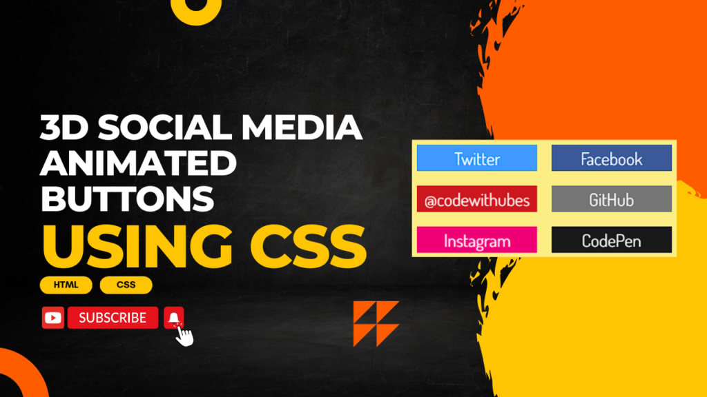
Creating 3D animated social media buttons using CSS can make your website more interactive and visually appealing. Below is an example of how you can create such buttons with hover effects for popular social media platforms.
In this tutorial, you’ll learn how to create stylish 3D animated social media buttons using CSS. These buttons will have smooth hover effects that give them a 3D appearance, making them more engaging for users. Each button is customized for different social media platforms such as Facebook, Twitter, Instagram, and LinkedIn.
HTML:
Create an HTML file and add the following code:
<!DOCTYPE html>
<html lang="en">
<head>
    <meta charset="UTF-8">
    <meta name="viewport" content="width=device-width, initial-scale=1.0">
    <title>CSS sibling selector when hover</title>
    <link rel="stylesheet" href="styles.css">
</head>
<body>
<div class="container">
  <a href="https://twitter.com/" class="social-container twitter">
    <div class="social-cube">
      <div class="front">
        Twitter
      </div>
      <div class="bottom">
        Username
      </div>
    </div>
  </a>

  <a href="https://www.facebook.com/profile.php?id=61559604676562" class="social-container facebook">
    <div class="social-cube">
      <div class="front">
        Facebook
      </div>
      <div class="bottom">
        codewithubes
      </div>
    </div>
  </a>

  <a href="https://www.youtube.com/@codewithubes" class="social-container youtube">
    <div class="social-cube">
      <div class="front">
        YouTube
      </div>
      <div class="bottom">
        @codewithubes
      </div>
    </div>
  </a>

  <a href="#" class="social-container github">
    <div class="social-cube">
      <div class="front">
        GitHub
      </div>
      <div class="bottom">
        Username
      </div>
    </div>
  </a>

  <a href="https://www.instagram.com/codewithubes" class="social-container instagram">
    <div class="social-cube">
      <div class="front">
        Instagram
      </div>
      <div class="bottom">
        codewithubes
      </div>
    </div>
  </a>

  <a href="#" class="social-container codepen">
    <div class="social-cube">
      <div class="front">
        CodePen
      </div>
      <div class="bottom">
        Username
      </div>
    </div>
  </a>
</div>
</body>
</html>
CSS:
Create a styles.css file and add the following code:
@import url('https://fonts.googleapis.com/css?family=Dosis');
 body {
	 font-family: 'Dosis';
	 background: #fcee85;
	 display: flex;
	 height: 100vh;
	 margin: 0;
	 justify-content: center;
	 align-items: center;
}
 body .container {
	 text-align: center;
	 max-width: 550px;
}
 .social-container {
	 position: relative;
	 display: inline-block;
	 width: 164px;
	 height: 36px;
	 perspective: 300px;
	 font-size: 24px;
	 margin: 8px;
}
 .social-container .social-cube {
	 position: absolute;
	 left: 0;
	 top: 0;
	 width: 100%;
	 height: 100%;
	 transform-style: preserve-3d;
	 transition: all 0.333s;
	 transform: translateZ(-18px);
}
 .social-container .social-cube .front, .social-container .social-cube .bottom {
	 position: absolute;
	 top: 0;
	 left: 0;
	 width: 100%;
	 height: 100%;
	 display: flex;
	 justify-content: center;
	 align-items: center;
	 color: #fff;
	 transition: background 0.333s;
}
 .social-container .social-cube .front {
	 transform: rotateX(0deg) translateZ(18px);
}
 .social-container .social-cube .bottom {
	 transform: rotateX(-90deg) translateZ(18px);
}
 .social-container:hover .social-cube {
	 transform: translateZ(-18px) rotateX(90deg);
}
 .social-container.twitter .social-cube .front, .social-container.twitter .social-cube .back {
	 background: #4099ff;
}
 .social-container.twitter .social-cube .bottom {
	 background: #0d7eff;
}
 .social-container.twitter:hover .social-cube .bottom {
	 background: #4099ff;
}
 .social-container.twitter:hover .social-cube .front {
	 background: #73b4ff;
}
 .social-container.facebook .social-cube .front, .social-container.facebook .social-cube .back {
	 background: #3b5998;
}
 .social-container.facebook .social-cube .bottom {
	 background: #2d4373;
}
 .social-container.facebook:hover .social-cube .bottom {
	 background: #3b5998;
}
 .social-container.facebook:hover .social-cube .front {
	 background: #4c70ba;
}
 .social-container.youtube .social-cube .front, .social-container.youtube .social-cube .back {
	 background: #cc181e;
}
 .social-container.youtube .social-cube .bottom {
	 background: #9e1317;
}
 .social-container.youtube:hover .social-cube .bottom {
	 background: #cc181e;
}
 .social-container.youtube:hover .social-cube .front {
	 background: #e73036;
}
 .social-container.github .social-cube .front, .social-container.github .social-cube .back {
	 background: #767676;
}
 .social-container.github .social-cube .bottom {
	 background: #5d5d5d;
}
 .social-container.github:hover .social-cube .bottom {
	 background: #767676;
}
 .social-container.github:hover .social-cube .front {
	 background: #909090;
}
 .social-container.instagram .social-cube .front, .social-container.instagram .social-cube .back {
	 background: #f00075;
}
 .social-container.instagram .social-cube .bottom {
	 background: #f00075;
}
 .social-container.instagram:hover .social-cube .bottom {
	 background: #f00075;
}
 .social-container.instagram:hover .social-cube .front {
	 background: #f00075;
}
 .social-container.codepen .social-cube .front, .social-container.codepen .social-cube .back {
	 background: #191919;
}
 .social-container.codepen .social-cube .bottom {
	 background: #000;
}
 .social-container.codepen:hover .social-cube .bottom {
	 background: #191919;
}
 .social-container.codepen:hover .social-cube .front {
	 background: #333;
}
By following this guide, you can create visually appealing and interactive social media buttons that enhance the overall user experience on your website.
Happy coding!