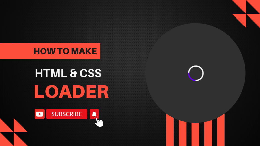
Creating a loader using HTML and CSS is a straightforward process. Here’s a simple example of a CSS spinner loader:
Step 1: HTML
Create an HTML file and add the following code:
<!DOCTYPE html>
<html lang="en">
<head>
    <meta charset="UTF-8">
    <meta name="viewport" content="width=device-width, initial-scale=1.0">
    <title>CSS Loader</title>
    <link rel="stylesheet" href="styles.css">
</head>
<body>
    <div class="loader"></div>
</body>
</html>
Step 2: CSS
Create a styles.css file and add the following code:
body {
    display: flex;
    justify-content: center;
    align-items: center;
    height: 100vh;
    background-color: #f0f0f0;
    margin: 0;
}
.loader {
    position: fixed;
    top: 0;
    left: 0;
    width: 100%;
    height: 100%;
    background: rgba(0, 0, 0, 0.8); display: flex;
    justify-content: center;
    align-items: center;
    z-index: 9999;
}
.loader::before {
    content: "";
    width: 50px;
    height: 50px;
    border: 5px solid #fff;
    border-top: 5px solid #6200ea;
    border-radius: 50%;
    animation: spin 1s linear infinite;
}
@keyframes spin {
    0% {
        transform: rotate(@deg);
    }
    100% {
        transform: rotate(360deg);
    }
}
Explanation
- HTML:
- The HTML file contains a single
divwith the classloader. Thisdivwill be styled as a spinning loader.
- The HTML file contains a single
- CSS:
- The
bodyis styled to center the loader both horizontally and vertically. - The
.loaderclass defines the appearance of the loader:- A solid border with a different color for the top border to create the spinning effect.
border-radius: 50%makes it a circle.widthandheightset the size of the loader.- The
animationproperty applies thespinanimation, which rotates the loader indefinitely.
- The
@keyframes spindefines the animation:- It starts at 0 degrees and ends at 360 degrees to complete a full rotation.
- The
Usage
Simply open the HTML file in a browser to see the loader in action. You can customize the loader by adjusting the size, colors, and animation speed in the CSS file.
This basic example can be extended and customized to fit the design of your project.
Happy coding!


