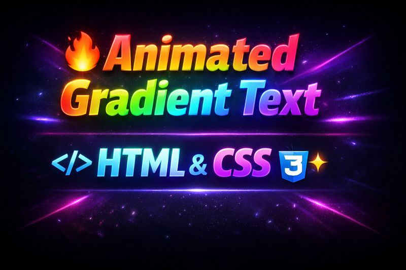
Learn how to create a stunning animated gradient text effect using just HTML and CSS! This modern CSS trick brings your website headings and titles to life with smooth transitions and vibrant colors. Perfect for portfolios, landing pages, or any creative front-end project.
🔧 What you’ll learn:
- CSS gradient text technique
- Using
@keyframesfor animation - Styling with
background-clipandtext-fill-color - Lightweight and responsive design
💡 No JavaScript required!
👍 Like, 💬 Comment, and 🔔 Subscribe for more CSS effects and web animations!
HTML:
Create an HTML file and add the following code:
<div class="loading-text">
	Code
	<br />
	<span>With</span>
	<br />
	Ubes
</div>
CSS:
Create a CSS file and add the following code:
html, body {
	display: grid
}
html {
	height: 100%
}

body {
	background: #222
}

.loading-text {
	place-self: center;
	background: linear-gradient(90deg, #00f, #0ff, #00f) -100%/ 200%;
	-webkit-background-clip: text;
	background-clip: text;
	color: transparent;
	text-align: center;
	font: 900 clamp(2em, 10vw, 5em) exo, sans-serif;
	animation: shimmer 2s linear infinite;
}

.loading-text span{
	font-size: 48px;
}

@keyframes shimmer {
	to {
		background-position: 100%
	}
}
Happy coding!
CSSEffects #GradientText #WebDesign #FrontendDevelopment #HTMLCSS #TextAnimation #AnimatedText #CSSOnly #CreativeCoding #UIMagic