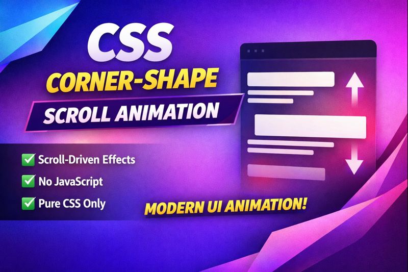
The animation is about the corners of the shape moving and changing. We are going to make this animation happen using CSS. CSS is a way to make websites look nice. We will use CSS to style the webpage and make the animation happen. We do not need to use JavaScript to make this animation happen. JavaScript is a way to add things to websites, but we will not need it for this animation.
When you scroll down the page, the corner shapes will move smoothly. The corner shapes moving smoothly is an effect. It looks really nice when the corner shapes move like that. The corner shapes are what make this effect so good.
I think this technique is really good for making things like buttons and menus on a website. It is also great for creating layouts and animations.
If you are new to this or if you are a front-end developer, the CSS animation that happens when you scroll down a website will really help you get better at designing websites.
The CSS animation that happens when you scroll is a way to improve your website design skills.
Using CSS animation will make your website look more modern.
The CSS animation is a way to make your website design skills better, and it will make your website look really cool.
I like CSS animation because it makes a website look more modern. It is a great thing to know how to do if you want to design websites.
✨ This is what you will learn:
- CSS corner-shape design techniques
- Scroll-driven animations using modern CSS
- Creating smooth UI effects without JavaScript
- Performance-friendly animation practices
HTML:
Create an HTML file and add the following code:
<div class="preview-box"></div>CSS:
Create a CSS file and add the following code:
@property --bg-color {
  syntax: "<color>";
  initial-value: #0b1020;
  inherits: false;
}

@property --text-color {
  syntax: "<color>";
  initial-value: #00f5d4;
  inherits: false;
}

@property --angle {
  syntax: "<angle>";
  initial-value: 0deg;
  inherits: false;
}

:root {
  --bg-color: #0b1020;

  --g1: #ff6ec7;
  --g2: #6a5cff;
  --g3: #00f5d4;
  --g4: #fca311;

  --t1: #00f5d4;
  --t2: #ff6ec7;
  --t3: #fca311;
  --t4: #6a5cff;
}

@keyframes corner-shape-animation {
  0% {
    corner-shape: round;
  }
  8.33% {
    corner-shape: superellipse(-2) round;
  }
  16.66% {
    corner-shape: squircle;
  }
  25% {
    corner-shape: superellipse(4) squircle;
  }
  33.33% {
    corner-shape: superellipse(0.4);
  }
  41.66% {
    corner-shape: bevel;
  }
  50% {
    corner-shape: superellipse(-2) bevel;
  }
  58.33% {
    corner-shape: notch;
  }
  66.66% {
    corner-shape: superellipse(-2) notch;
  }
  75% {
    corner-shape: square;
  }
  83.33% {
    corner-shape: scoop;
  }
  91.66% {
    corner-shape: superellipse(-2) scoop;
  }
  100% {
    corner-shape: round;
  }
}

@keyframes gradient-animation {
  to {
    --angle: 1turn;
  }
}

@keyframes text-animation {
  0% {
    --text-color: var(--t1);
  }
  25% {
    --text-color: var(--t2);
  }
  50% {
    --text-color: var(--t3);
  }
  75% {
    --text-color: var(--t4);
  }
  100% {
    --text-color: var(--t1);
  }
}

* {
  margin: 0;
  box-sizing: border-box;
}

body {
  height: 400vh;
  height: 400dvh;
  background: var(--bg-color);
  font-family: "Geist", system-ui, sans-serif;
  overflow-y: auto;
}

.preview-box {
  position: fixed;
  inset: 50% auto auto 50%;
  transform: translate(-50%, -50%);
  width: 70vmin;
  aspect-ratio: 1;
  display: grid;
  border-radius: 10vw;

  box-shadow: var(--bg-color) 10px -10px 0px -3px, #ff6ec7 10px -10px,
    var(--bg-color) 20px -20px 0px -3px, #6a5cff 20px -20px,
    var(--bg-color) 30px -30px 0px -3px, #00f5d4 30px -30px,
    var(--bg-color) 40px -40px 0px -3px, #fca311 40px -40px;
}

.preview-box::before {
  content: "";
  grid-area: 1 / 1;
  padding: 3px;
  border-radius: inherit;

  background: linear-gradient(var(--bg-color) 0 0) content-box,
    conic-gradient(
      from var(--angle),
      var(--g1),
      var(--g2),
      var(--g3),
      var(--g4),
      var(--g1)
    );

  animation: gradient-animation 4s linear infinite;
}

.preview-box::after {
  content: "Review this demo in latest browser";
  grid-area: 1 / 1;
  place-self: center;
  text-align: center;
  font-size: clamp(20px, 7vmin, 40px);
  font-weight: 600;
  padding: 16px;
  color: var(--text-color);
}

@supports (corner-shape: round) and (animation-timeline: scroll()) {
  .preview-box {
    corner-shape: round;
    animation-name: corner-shape-animation;
    animation-timeline: scroll();
    animation-duration: 10s;
    animation-fill-mode: both;
    animation-timing-function: cubic-bezier(0.25, 0.1, 0.25, 1);
  }

  .preview-box::before {
    corner-shape: inherit;
  }

  .preview-box::after {
    content: "⬇ Scroll the page ⬇";
    animation-name: text-animation;
    animation-timeline: scroll();
    animation-duration: 10s;
    animation-fill-mode: both;
    animation-timing-function: cubic-bezier(0.25, 0.1, 0.25, 1);
  }
}
css #cssanimation #scrolldrivenanimation #moderncss #webdesign #frontend #uianimation #creativecss
Happy coding!