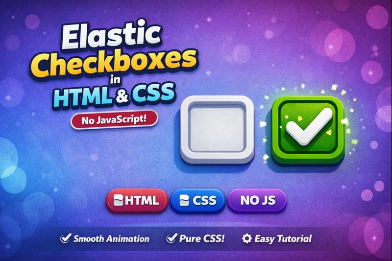
Learn how to create elastic checkboxes using pure HTML & CSS with smooth, bouncy animations ✨
In this tutorial, we build a modern checkbox UI using CSS transitions, transforms, and cubic-bezier easing — no JavaScript required.
Perfect for:
- Modern UI/UX design
- CSS animation practice
- Forms & dashboard interfaces
- Beginners & frontend developers
🔹 Clean markup
🔹 Lightweight CSS
🔹 Fully responsive
🔹 Easy to customize
📎 Source code included
👍 Like, Share & Subscribe for more HTML & CSS UI effects!
HTML:
Create a HTML file and add the following code:
<div class="content">
    <h1>What are your favorite places in nature?</h1>
    <label>mountain <input type="checkbox" id="mountain"></label>
    <label>ocean <input type="checkbox" id="ocean"></label>
    <label>forest <input type="checkbox" id="forest"></label>
    <label>river <input type="checkbox" id="river"></label>
    <label>desert <input type="checkbox" id="desert"></label>
    <label>jungle <input type="checkbox" id="jungle"></label>
    <label>beach <input type="checkbox" id="beach"></label>
    <label>tropical <input type="checkbox" id="tropical"></label>
    <label>tundra <input type="checkbox" id="tundra"></label>
    <label>artic <input type="checkbox" id="artic"></label>
    <label>lake <input type="checkbox" id="lake"></label>
    <label>savanna <input type="checkbox" id="savanna"></label>
    <label>snow <input type="checkbox" id="snow"></label>
    <label>grass <input type="checkbox" id="grass"></label>
    <label>taiga <input type="checkbox" id="taiga"></label>
    <label>pond <input type="checkbox" id="pond"></label>
  </div>
CSS:
Create a CSS file and add the following code:
:root {
      --sz: 8vmin;
      --sp: 0.35s;
      --ac: orange;
      --ic: #ebebeb;
    }
    *, *:before, *:after {
      box-sizing: border-box;
      transition: all var(--sp) cubic-bezier(0.68, -0.55, 0.265, 1.55) 0s;
    }
    body {
      margin: 0;
      padding: 0;
      width: 100vw;
      height: 100vh;
      overflow: hidden;
      display: flex;
      align-items: center;
      justify-content: center;
      flex-direction: column;
      font-family: Arial, Helvetica, sans-serif;
      background: linear-gradient(135deg, #1f1f23, #2d2d31, #101012);
    }
    body:before, body:after {
      content: "";
      position: absolute;
      width: 100%;
      height: 100%;
      opacity: 0.75;
      filter: blur(0.75px);
      z-index: 0;
      background: repeating-conic-gradient(#0002 0.000095%, #fff0 0.0005%, #fff0 0.005%, #fff0 0.0005%), repeating-conic-gradient(#0002 0.00001%, #fff0 0.00009%, #fff0 0.00075%, #fff0 0.000025%);
    }
    body h1 {
      color: var(--ic);
      margin-bottom: calc(var(--sz) * 0.25);
      font-weight: 500;
      font-size: calc(var(--sz) * 0.25);
      display: block;
      width: 100%;
      padding: 0 calc(var(--sz) * 0.2);
    }
    body .content {
      position: relative;
      width: 100%;
      max-width: calc(var(--sz) * 8.25);
      display: flex;
      z-index: 1;
      flex-wrap: wrap;
      justify-content: flex-start;
      align-content: center;
      background: #0002;
      padding: calc(var(--sz) * 0.35);
      border-radius: calc(var(--sz) * 0.25);
      box-shadow: 0 0 calc(var(--sz) * 0.01) calc(var(--sz) * 0.01) #ebebeb inset;
    }
    body .content label {
      position: relative;
      width: calc(var(--sz) * 1.5);
      width: auto;
      text-transform: Capitalize;
      height: calc(var(--sz) * 0.75);
      background: linear-gradient(0deg, #12172080, #0d121780);
      border-radius: var(--sz);
      display: flex;
      align-items: center;
      padding: calc(var(--sz) * 0.25) calc(var(--sz) * 0.25) calc(var(--sz) * 0.25) calc(var(--sz) * 0.375);
      font-size: calc(var(--sz) * 0.25);
      color: var(--ic);
      font-family: Arial, Helvetica, sans-serif;
      margin: calc(var(--sz) * 0.125);
      cursor: pointer;
      box-shadow: 0 0 0 calc(var(--sz) * 0.015) var(--ic) inset;
      overflow: hidden;
    }
    body .content label::after {
      content: "";
      position: relative;
      width: 0;
      height: 0;
      margin-left: calc(var(--sz) * 0.125);
      border-radius: var(--sz);
      font-size: 0;
      background: linear-gradient(230deg, var(--ac) 0 calc(var(--sz) * 0.12), #fff0 0 100%), linear-gradient(142deg, var(--ac) 0 calc(var(--sz) * 0.14), #fff0 0 100%), conic-gradient(from 43deg at 43% calc(64% + calc(var(--sz) * 0.03)), #fff0 0 0%, var(--ac) 1% 76%, #fff0 77% 100%), conic-gradient(from -45deg at 43% 64%, #fff0 0 0%, var(--ac) 2% 25%, #fff0 26% 100%);
    }
    body .content label:has(input:checked) {
      box-shadow: 0 0 0 2px var(--ac) inset;
      color: var(--ac);
    }
    body .content label:has(input:checked)::after {
      width: calc(var(--sz) * 0.25);
      height: calc(var(--sz) * 0.25);
      overflow: hidden;
      font-size: 22px;
    }
    body .content input {
      display: none;
    }
    @media screen and (max-width: 767px) {
      :root {
        --sz: 80px;
      }
      body {
        height: auto;
        overflow-y: visible;
        justify-content: flex-start;
        align-items: center;
        padding: calc(var(--sz) * 0.5);
        background: #232323 !important;
        padding-bottom: calc(var(--sz) * 0.5) !important;
      }
      body::before, body::after {
        display: none;
      }
      body .content {
        height: 100%;
        padding: 0 !important;
        align-content: flex-start !important;
        max-width: 100% !important;
        box-shadow: none !important;
        background: #ffffff00 !important;
      }
      body .content label {
        font-size: calc(var(--sz) * 0.22) !important;
        height: calc(var(--sz) * 0.625) !important;
      }
    }
    @media screen and (max-height: 580px) and (orientation: landscape) {
      :root {
        --sz: 60px !important;
      }
      body {
        overflow-x: visible;
        justify-content: center !important;
        align-items: center !important;
        padding: calc(var(--sz) * 0.5);
      }
      body .content {
        max-width: 100% !important;
        justify-content: center !important;
      }
      body .content h1 {
        text-align: center !important;
      }
    }
html #css #checkbox #animation #elastic #cssanimation #frontend #webdesign #uidesign #purecss
Happy coding!