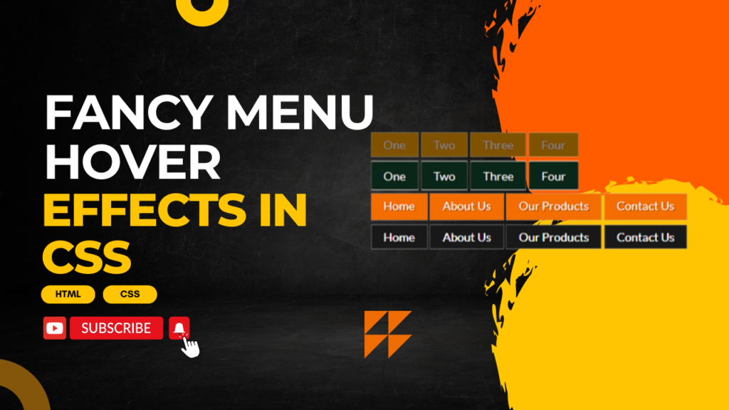
Creating fancy menu hover effects with CSS can make your website more visually appealing and interactive. Here are a few examples of different hover effects you can implement on a navigation menu.
HTML:
Create an HTML file and add the following code:
<!DOCTYPE html>
<html lang="en">
<head>
    <meta charset="UTF-8">
    <meta name="viewport" content="width=device-width, initial-scale=1.0">
    <title>Fancy menu hover effects</title>
    <link href="styles.css" rel="stylesheet" />
</head>
<body>
    <div class="menu two">
        <ul>
            <li><a href="javascript:void(0);">One</a></li>
            <li><a href="javascript:void(0);">Two</a></li>
            <li><a href="javascript:void(0);">Three</a></li>
            <li><a href="javascript:void(0);">Four</a></li>
        </ul>
    </div>

    <div class="menu one">
        <ul>
            <li><a href="javascript:void(0);">One</a></li>
            <li><a href="javascript:void(0);">Two</a></li>
            <li><a href="javascript:void(0);">Three</a></li>
            <li><a href="javascript:void(0);">Four</a></li>
        </ul>
    </div>

    <div class="menu nav2">
        <ul>
            <li>
                <a href="#">
                    <span>Home</span>
                    <span class="hidden-span">Home</span>
                </a>
            </li>
            <li>
                <a href="#">
                    <span>About Us</span>
                    <span class="hidden-span">About Us</span>
                </a>
            </li>
            <li>
                <a href="#">
                    <span>Our Products</span>
                    <span class="hidden-span">Our Products</span>
                </a>
            </li>
            <li>
                <a href="#">
                    <span>Contact Us</span>
                    <span class="hidden-span">Contact Us</span>
                </a>
            </li>
        </ul>
    </div>

    <div class="menu nav4">
        <ul>
            <li>
                <a href="#">
                    <span>Home</span>
                    <span class="text-copy">Home</span>
                </a>
            </li>
            <li>
                <a href="#">
                    <span>About Us</span>
                    <span class="text-copy">About Us</span>
                </a>
            </li>
            <li>
                <a href="#">
                    <span>Our Products</span>
                    <span class="text-copy">Our Products</span>
                </a>
            </li>
            <li>
                <a href="#">
                    <span>Contact Us</span>
                    <span class="text-copy">Contact Us</span>
                </a>
            </li>
        </ul>
    </div>
</body>
</html>
CSS:
Create a styles.css file and add the following code:
@import url('https://fonts.googleapis.com/css?family=Lato:100,100i,300,300i,400,400i,700,700i,900,900i');

* {
	margin: 0;
	padding: 0;
  box-sizing: border-box;
}

body {
	font-family: 'Lato', sans-serif;
	font-size: 14px;
	color: #999999;
	word-wrap:break-word;
}

ul { list-style: none; }
.menu { margin: 60px auto 0; width: 700px; }
.menu li { display: inline-block; }
.menu li a {
	display: block; padding: 6px 15px;
	background: orange; color: white;
	position: relative; height: 100%; text-decoration: none;
}
.menu li a:before {
	position: absolute; content: "";
	top: 0; left: 0; width: 100%; height: 100%; transition: .2s;
}
.two li a:before {
	background: rgba(0, 0, 0, .5); transform-origin: 0 100%;
}
.two li a:hover:before { animation: dropIt .8s forwards linear; }
@keyframes dropIt {
	20% { transform: rotate(170deg); }
	40% { transform: rotate(40deg); }
	70% { transform: rotate(120deg); }
	99% { transform: translate(0, 150px) rotate(90deg); }
	100% { opacity: 0; }
}
/* .one effects */
.one li a, .one li a:link, .one li a:visited {
	display: block; height: 36px;
	padding: 10px 15px; background: #092618;
	transition: all .2s ease;
	box-shadow: inset 0 2px 0 rgba(255, 255, 255, .5), inset 0 -2px 0 rgba(255, 255, 255, .5);
}

.one li a:hover {
	text-decoration: none; color: #ff7200;
	box-shadow: inset 0 18px 0 rgba(255, 255, 255, .1), inset 0 -18px 0 rgba(255, 255, 255, .1);
}
/* .nav2 effects */
.nav2 { text-shadow: 1px 1px 0 #b14f00; }
.nav2 li a, .nav2 li a:link, .nav2 li a:visited {
	background: #f36d00; box-shadow: none; height: 32px;
}
.nav2 li a span { display: block; transition: all .15s ease-in; }
.hidden-span { opacity: 0; }
.nav2 li a:hover { color: #fff; }
.nav2 li a:hover span {
	transform: translateY(-25px);
	-webkit-transform: translateY(-25px); opacity: 0;
}
.nav2 li a:hover .hidden-span {
	transform: translateY(-18px);
	-webkit-transform: translateY(-17px);
	text-shadow: 0 0 10px #fff; opacity: 1;
}
/* .nav4 effects */
.nav4 li a, .nav4 li a:link, .nav4 li a:visited {
	position: relative; background: #181818;
}
.text-copy {
	position: absolute; left: 15px;
	top: 6px; transition: all .2s ease-in;
}

.nav4 li a:hover { color: #fff; }
.nav4 li a:hover .text-copy {
	opacity: 0; transform: scale(2); -webkit-transform: scale(2);
}
Happy coding!