Skip to content
-
Subscribe to our YouTube Channel & never miss our best posts. Subscribe Now!
Ubes_Logo Code With Ubes
  • Home
  • About
  • Blog
  • Skills
  • Contact Us
  • Instagram
  • Youtube
Home » Blog » Glassmorphism Login Form Tutorial | Modern UI Design in HTML & CSS
Glassmorphism Login Form Tutorial
Glassmorphism Login Form
Posted inCSS CSS3 HTML

Glassmorphism Login Form Tutorial | Modern UI Design in HTML & CSS

Posted by Ubes Aslam January 6, 2026

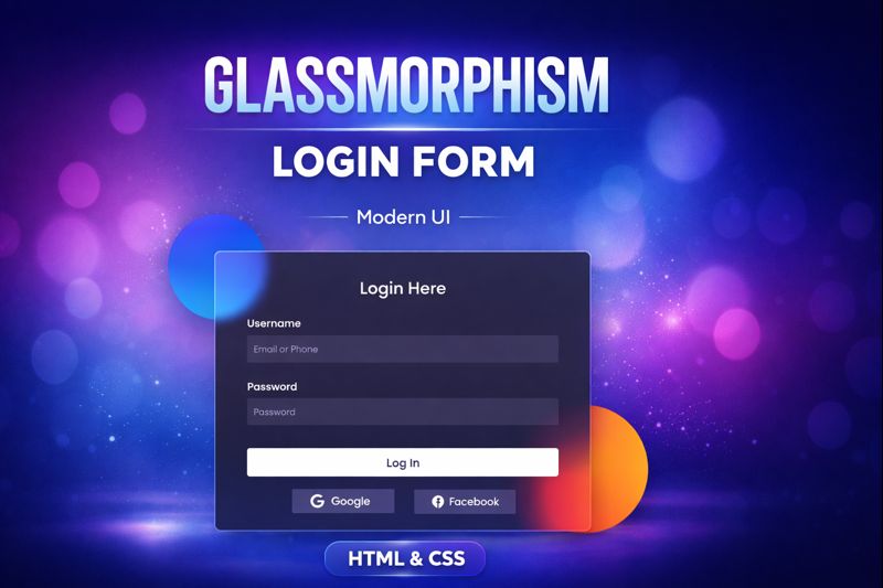
In this tutorial, you’ll learn how to create a Glassmorphism Login Form using pure HTML & CSS.
We’ll design a modern, frosted-glass style login UI with blur effects, transparency, and smooth styling—perfect for modern websites and portfolios.

✨ What you’ll learn:

  • Glassmorphism UI design principles
  • CSS backdrop-filter & blur effects
  • Transparent cards with gradients
  • Responsive login form layout
  • Clean & modern HTML CSS structure

This tutorial is beginner-friendly and does not require JavaScript.

👍 If you like modern UI designs, don’t forget to Like, Share & Subscribe!

HTML:

Create a HTML file and add the following code:

<div class="background">
    <div class="shape"></div>
    <div class="shape"></div>
  </div>
  <form>
    <h3>Login Here</h3>

    <label for="username">Username</label>
    <input type="text" placeholder="Email or Phone" />

    <label for="password">Password</label>
    <input type="password" placeholder="Password" />

    <button>Log In</button>
    <div class="social">
      <div class="go">
        <i class="fab fa-google"></i>  Google
      </div>
      <div class="fb">
        <i class="fab fa-facebook"></i>  Facebook
      </div>
    </div>
  </form>

CSS:

Create a CSS file and add the following code:

*, *:before, *:after{
  padding: 0; 
  margin: 0; 
  box-sizing: border-box;
}
body{ 
  background-color: #080710; 
}
.background{
  width: 430px; 
  height: 520px; 
  position: absolute;
  transform: translate(-50%,-50%); 
  left: 50%; 
  top: 50%;
}
.background .shape{
  height: 200px; 
  width: 200px;
  position: absolute; 
  border-radius: 50%;
}
.shape:first-child{
  background: linear-gradient(
    #1845ad, 
    #23a2f6
  );
  left: -80px; 
  top: -80px;
}
.shape:last-child{
  background: linear-gradient( 
    to right, 
    #ff512f, 
    #f09819
  ); 
  right: -30px; 
  bottom: -80px;
}
form{
  height: 520px; 
  width: 400px;
  background-color: rgba(255,255,255,0.13);
  position: absolute; 
  transform: translate(-50%,-50%);
  top: 50%; 
  left: 50%; 
  border-radius: 10px;
  backdrop-filter: blur(10px); 
  padding: 50px 35px;
  border: 2px solid rgba(255,255,255,0.1);
  box-shadow: 0 0 40px rgba(8,7,16,0.6);
}
form *{
  font-family: 'Poppins',sans-serif; 
  color: #ffffff;
  letter-spacing: 0.5px; 
  outline: none;
  border: none;
}
form h3{
  font-size: 32px;
  font-weight: 500;
  line-height: 42px;
  text-align: center;
}
label{
  display: block;
  margin-top: 30px;
  font-size: 16px;
  font-weight: 500;
}
input{
  display: block;
  height: 50px;
  width: 100%;
  background-color: rgba(255,255,255,0.07);
  border-radius: 3px;
  padding: 0 10px;
  margin-top: 8px;
  font-size: 14px;
  font-weight: 300;
}
::placeholder{
  color: #e5e5e5;
}
button{
  margin-top: 50px;
  width: 100%;
  background-color: #ffffff;
  color: #080710;
  padding: 15px 0;
  font-size: 18px;
  font-weight: 600;
  border-radius: 5px;
  cursor: pointer;
}
.social{
  margin-top: 30px;
  display: flex;
}
.social div{
  background: red;
  width: 150px;
  border-radius: 3px;
  padding: 5px 10px 10px 5px;
  background-color: rgba(255,255,255,0.27);
  color: #eaf0fb;
  text-align: center;
}
.social div:hover{
  background-color: rgba(255,255,255,0.47);
}
.social .fb{
  margin-left: 25px;
}
.social i{
  margin-right: 4px;
}

Script:

<link rel="stylesheet" href="https://cdnjs.cloudflare.com/ajax/libs/font-awesome/5.15.4/css/all.min.css" />
<link rel="stylesheet" href="https://fonts.googleapis.com/css2?family=Poppins:wght@300;500;600&display=swap" />

glassmorphism #loginform #htmlcss #uidesign #webdesign #frontend #cssdesign #moderndesign #glassui

Happy coding!

Tags:
css backdrop filterfrontend developmentglass ui designglassmorphism cssglassmorphism login formhtml css login formlogin form html cssmodern login form cssui design html cssweb design tutorial
Last updated on January 6, 2026
Ubes Aslam
I've been working in the tech industry for 9 years and during that time, I've gained a wealth of knowledge and experience that I'm excited to share with my audience. I specialize in Laravel, ReactJs, PHP & MySQL, and I'm always learning and expanding my knowledge in this field.
View All Posts

Post navigation

Previous Post
Payment Status Screen in HTML & CSS Payment Status Screen UI Design in HTML & CSS | Success, Failed & Pending States
Next Post
Minimal Dot Clock ⏱️ | 24 Hour Digital Clock using HTML, CSS & JavaScript Minimal Dot Clock

Ubes Aslam

I specialize in Laravel, PHP, MySQL, and React JS, and I continuously expand my skill set by learning new tools, frameworks, and best practices to stay up to date with modern web development.

  • Facebook
  • Instagram
  • YouTube

Recent Blogs

  • CSS Corner-Shape Animation with Scroll-Driven Effects
    CSS Corner-Shape Animation with Scroll-Driven Effects | Modern UI Animation
    by Ubes Aslam
    January 17, 2026
  • Fancy Cards with Hover Effects
    Fancy Cards with Hover Effects in HTML & CSS | Modern UI Card Design
    by Ubes Aslam
    January 16, 2026
  • Polished Button Collection
    Polished Button Collection in HTML & CSS | Shiny Gradient Buttons with Hover Effects
    by Ubes Aslam
    January 12, 2026
  • Search Engine with Voice Search
    Search Engine with Voice Search 🎤 | HTML CSS Voice Recognition
    by Ubes Aslam
    January 11, 2026
Tags

css css3 frontend development frontend ui design html html css animation javascript jquery mysql responsive web design web design tutorial

About Myself

I specialize in Laravel, Codeigniter, ReactJs, ReactNative, PHP & MySQL, and I’m always learning and expanding my knowledge in this field.

  • Facebook
  • Instagram
  • YouTube
  • About Us
  • Blog
  • Contact Us
  • Disclaimer
  • Home
  • Portfolio
  • Privacy Policy
  • Skills
  • Terms & Conditions
  • CSS Corner-Shape Animation with Scroll-Driven Effects
    CSS Corner-Shape Animation with Scroll-Driven Effects | Modern UI Animation
    by Ubes Aslam
    January 17, 2026
  • Fancy Cards with Hover Effects
    Fancy Cards with Hover Effects in HTML & CSS | Modern UI Card Design
    by Ubes Aslam
    January 16, 2026
  • Polished Button Collection
    Polished Button Collection in HTML & CSS | Shiny Gradient Buttons with Hover Effects
    by Ubes Aslam
    January 12, 2026
Copyright 2026 — Code With Ubes. All rights reserved. Bloghash WordPress Theme
Scroll to Top