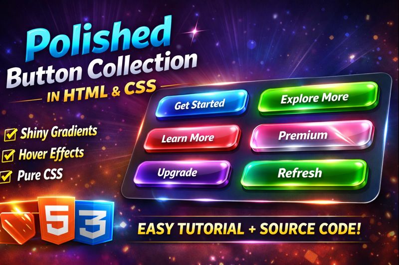
Create a stunning Polished Button Collection using pure HTML & CSS ✨
In this tutorial, you’ll learn how to design shiny gradient buttons with smooth hover animations and light sweep effects—perfect for modern websites, landing pages, and UI projects.
🚀 What you’ll learn in this video:
- Creating polished UI buttons using HTML & CSS
- Gradient button design techniques
- Shine / light sweep animation using CSS
- Smooth hover effects for modern UI
- Responsive button layout with CSS Grid
💡 No JavaScript required — clean, lightweight, and beginner-friendly!
👉 Source code included – Feel free to customize colors and animations.
👍 If you enjoyed the video, don’t forget to Like, Share & Subscribe for more web design tutorials!
HTML:
Create a HTML file and add the following code:
<div class="showcase">

  <div class="button-collection">
    <div class="button-wrapper">
      <span class="button-label">Ocean Waves</span>
      <button class="shine-button button-ocean">Get Started</button>
    </div>

    <div class="button-wrapper">
      <span class="button-label">Emerald Forest</span>
      <button class="shine-button button-emerald">Explore More</button>
    </div>

    <div class="button-wrapper">
      <span class="button-label">Sunset Glow</span>
      <button class="shine-button button-sunset">Learn More</button>
    </div>

    <div class="button-wrapper">
      <span class="button-label">Deep Ocean</span>
      <button class="shine-button button-deep">Dive In</button>
    </div>

    <div class="button-wrapper">
      <span class="button-label">Golden Hour</span>
      <button class="shine-button button-gold">Discover</button>
    </div>

    <div class="button-wrapper">
      <span class="button-label">Chrome Polish</span>
      <button class="shine-button button-chrome">Premium</button>
    </div>

    <div class="button-wrapper">
      <span class="button-label">Royal Purple</span>
      <button class="shine-button button-purple">Upgrade</button>
    </div>

    <div class="button-wrapper">
      <span class="button-label">Fresh Mint</span>
      <button class="shine-button button-mint">Refresh</button>
    </div>

    <div class="button-wrapper">
      <span class="button-label">Electric Lime</span>
      <button class="shine-button button-electric">Energise</button>
    </div>

    <div class="button-wrapper">
      <span class="button-label">Soft Lavender</span>
      <button class="shine-button button-lavender">Relax</button>
    </div>

    <div class="button-wrapper">
      <span class="button-label">Fire Ember</span>
      <button class="shine-button button-fire">Ignite</button>
    </div>

    <div class="button-wrapper">
      <span class="button-label">Forest Depths</span>
      <button class="shine-button button-forest">Explore</button>
    </div>
  </div>
</div>
CSS:
Create a CSS file and add the following code:
@import url('https://fonts.googleapis.com/css2?family=Inter:wght@400;500;600;700&display=swap');

* {
  margin: 0;
  padding: 0;
  box-sizing: border-box;
}

body {
  min-height: 100vh;
  background: #f8fafc;
  display: flex;
  align-items: center;
  justify-content: center;
  font-family: 'Inter', sans-serif;
  padding: 2rem;
}

.showcase {
  max-width: 900px;
  width: 100%;
  text-align: center;
}

.button-collection {
  display: grid;
  grid-template-columns: repeat(auto-fit, minmax(250px, 1fr));
  gap: 2.5rem;
  margin-bottom: 3rem;
}

.button-wrapper {
  display: flex;
  flex-direction: column;
  align-items: center;
  gap: 1rem;
}

.button-label {
  color: #64748b;
  font-size: 0.9rem;
  font-weight: 500;
  letter-spacing: 1px;
  text-transform: uppercase;
}

.shine-button {
  position: relative;
  padding: 1.2rem 2.5rem;
  font-size: 1.1rem;
  font-weight: 600;
  border: none;
  border-radius: 12px;
  cursor: pointer;
  overflow: hidden;
  transition: all 0.3s ease;
  letter-spacing: 0.5px;
  min-width: 200px;
}

.shine-button::before {
  content: '';
  position: absolute;
  height: 250%;
  width: 40px;
  top: 0;
  left: -60px;
  background: linear-gradient(90deg, transparent, rgba(255, 255, 255, 0.4), transparent);
  transform: rotate(45deg) translateY(-35%);
  animation: shine 3s ease infinite;
}

@keyframes shine {
  0% {
    left: -80px;
  }
  40% {
    left: calc(100% + 20px);
  }
  100% {
    left: calc(100% + 20px);
  }
}

.button-ocean {
  background: linear-gradient(135deg, #0ea5e9 0%, #2563eb 100%);
  color: #fff;
  box-shadow:
    0 10px 30px rgba(102, 126, 234, 0.4),
    inset 0 1px 0 rgba(255, 255, 255, 0.2);
}

.button-ocean:hover {
  transform: translateY(-3px);
  box-shadow:
    0 15px 40px rgba(102, 126, 234, 0.6),
    inset 0 1px 0 rgba(255, 255, 255, 0.3);
}

.button-emerald {
  background: linear-gradient(135deg, #10b981 0%, #059669 100%);
  color: #fff;
  box-shadow:
    0 10px 30px rgba(17, 153, 142, 0.4),
    inset 0 1px 0 rgba(255, 255, 255, 0.2);
}

.button-emerald:hover {
  transform: translateY(-3px);
  box-shadow:
    0 15px 40px rgba(17, 153, 142, 0.6),
    inset 0 1px 0 rgba(255, 255, 255, 0.3);
}

.button-sunset {
  background: linear-gradient(135deg, #fb7185 0%, #f43f5e 100%);
  color: #fff;
  box-shadow:
    0 10px 30px rgba(240, 147, 251, 0.4),
    inset 0 1px 0 rgba(255, 255, 255, 0.2);
}

.button-sunset:hover {
  transform: translateY(-3px);
  box-shadow:
    0 15px 40px rgba(240, 147, 251, 0.6),
    inset 0 1px 0 rgba(255, 255, 255, 0.3);
}

.button-deep {
  background: linear-gradient(135deg, #020617 0%, #1e293b 100%);
  color: #fff;
  box-shadow:
    0 10px 30px rgba(30, 58, 138, 0.4),
    inset 0 1px 0 rgba(255, 255, 255, 0.2);
}

.button-deep:hover {
  transform: translateY(-3px);
  box-shadow:
    0 15px 40px rgba(30, 58, 138, 0.6),
    inset 0 1px 0 rgba(255, 255, 255, 0.3);
}

.button-gold {
  background: linear-gradient(135deg, #facc15 0%, #ca8a04 100%);
  color: #fff;
  box-shadow:
    0 10px 30px rgba(247, 151, 30, 0.4),
    inset 0 1px 0 rgba(255, 255, 255, 0.3);
}

.button-gold:hover {
  transform: translateY(-3px);
  box-shadow:
    0 15px 40px rgba(247, 151, 30, 0.6),
    inset 0 1px 0 rgba(255, 255, 255, 0.4);
}

.button-chrome {
  background: linear-gradient(135deg, #e5e7eb 0%, #9ca3af 100%);
  color: #fff;
  box-shadow:
    0 10px 30px rgba(45, 62, 80, 0.4),
    inset 0 1px 0 rgba(255, 255, 255, 0.2),
    inset 0 -1px 0 rgba(0, 0, 0, 0.1);
}

.button-chrome:hover {
  background: linear-gradient(135deg, #d5dbdb 0%, #34495e 100%);
  transform: translateY(-3px);
  box-shadow:
    0 15px 40px rgba(45, 62, 80, 0.6),
    inset 0 1px 0 rgba(255, 255, 255, 0.3),
    inset 0 -1px 0 rgba(0, 0, 0, 0.1);
}

.button-purple {
  background: linear-gradient(135deg, #9333ea 0%, #6b21a8 100%);
  color: #fff;
  box-shadow:
    0 10px 30px rgba(139, 92, 246, 0.4),
    inset 0 1px 0 rgba(255, 255, 255, 0.2);
}

.button-purple:hover {
  transform: translateY(-3px);
  box-shadow:
    0 15px 40px rgba(139, 92, 246, 0.6),
    inset 0 1px 0 rgba(255, 255, 255, 0.3);
}

.button-mint {
  background: linear-gradient(135deg, #5eead4 0%, #14b8a6 100%);
  color: #fff;
  box-shadow:
    0 10px 30px rgba(45, 212, 191, 0.4),
    inset 0 1px 0 rgba(255, 255, 255, 0.2);
}

.button-mint:hover {
  transform: translateY(-3px);
  box-shadow:
    0 15px 40px rgba(45, 212, 191, 0.6),
    inset 0 1px 0 rgba(255, 255, 255, 0.3);
}

.button-electric {
  background: linear-gradient(135deg, #84cc16 0%, #22c55e 100%);
  color: #fff;
  box-shadow:
    0 10px 30px rgba(50, 255, 50, 0.4),
    inset 0 1px 0 rgba(255, 255, 255, 0.2);
}

.button-electric:hover {
  transform: translateY(-3px);
  box-shadow:
    0 15px 40px rgba(50, 255, 50, 0.6),
    inset 0 1px 0 rgba(255, 255, 255, 0.3);
}

.button-lavender {
  background: linear-gradient(135deg, #c4b5fd 0%, #8b5cf6 100%);
  color: #fff;
  box-shadow:
    0 10px 30px rgba(192, 132, 252, 0.4),
    inset 0 1px 0 rgba(255, 255, 255, 0.3);
}

.button-lavender:hover {
  transform: translateY(-3px);
  box-shadow:
    0 15px 40px rgba(192, 132, 252, 0.6),
    inset 0 1px 0 rgba(255, 255, 255, 0.4);
}

.button-fire {
  background: linear-gradient(135deg, #dc2626 0%, #f97316 100%);
  color: #fff;
  box-shadow:
    0 10px 30px rgba(255, 69, 0, 0.4),
    inset 0 1px 0 rgba(255, 255, 255, 0.2);
}

.button-fire:hover {
  transform: translateY(-3px);
  box-shadow:
    0 15px 40px rgba(255, 69, 0, 0.6),
    inset 0 1px 0 rgba(255, 255, 255, 0.3);
}

.button-forest {
  background: linear-gradient(135deg, #14532d 0%, #22c55e 100%);
  color: #fff;
  box-shadow:
    0 10px 30px rgba(19, 78, 94, 0.4),
    inset 0 1px 0 rgba(255, 255, 255, 0.2);
}

.button-forest:hover {
  transform: translateY(-3px);
  box-shadow:
    0 15px 40px rgba(19, 78, 94, 0.6),
    inset 0 1px 0 rgba(255, 255, 255, 0.3);
}

.shine-button:active {
  transform: translateY(-1px);
  transition: transform 0.1s ease;
}

.shine-button:hover {
  transform: translateY(-3px);
  filter: brightness(1.08);
}

@media (max-width: 768px) {
  .button-collection {
    grid-template-columns: 1fr;
    gap: 2rem;
  }

  .main-title {
    font-size: 2.5rem;
    letter-spacing: 1px;
  }

  .description {
    font-size: 1.1rem;
  }
}
html #css #webdesign #frontend #uicomponents #cssbuttons #gradientbuttons #shinybuttons #hovereffects #uidesign #coding #webdevelopment
Happy coding!