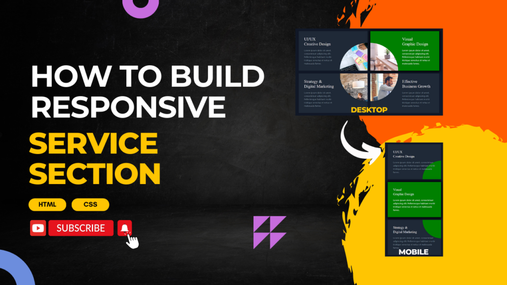
Learn how to create a stunning and responsive service section for your website using HTML and CSS. Perfect for beginners and web designers looking to enhance their skills. Follow along as we guide you step-by-step to build a modern design that looks great on all devices.
📌 Key Features:
- Responsive grid layout
- Modern and clean design
- CSS hover effects
- Perfect for any website
Don’t forget to like, share, and subscribe for more web design tutorials!
https://www.youtube.com/@codewithubes
#HTML #CSS #WebDevelopment
HTML:
Create an HTML file and add the following code:
<section class="min-h-screen bg-gray-900 text-center py-20 px-8 xl:px-0 flex flex-col justify-center">
  <span class="text-gray-400 text-lg max-w-lg mx-auto mb-2 capitalize flex items-center">what we're offering <svg xmlns="http://www.w3.org/2000/svg" fill="none" viewBox="0 0 24 24" stroke-width="1.5" stroke="green" class="text-indigo-600 ml-3 w-6 h-6">
      <path stroke-linecap="round" stroke-linejoin="round" d="M17.25 8.25 21 12m0 0-3.75 3.75M21 12H3" />
    </svg>
  </span>
  <h1 class="text-white text-4xl md:text-5xl xl:text-6xl font-semibold max-w-3xl mx-auto mb-16 leading-snug">Services Built Specifically for your Business</h1>
  <div class="grid-offer text-left grid sm:grid-cols-2 md:grid-cols-2 gap-5 max-w-5xl mx-auto">
    <div class="card bg-gray-800 p-10 relative">
      <div class="circle"></div>
      <div class="relative lg:pr-52">
        <h2 class="capitalize text-white mb-4 text-2xl xl:text-3xl">uI/uX <br /> creative design</h2>
        <p class="text-gray-400">Lorem ipsum dolor sit amet, consectetuer adipiscing elit. Pellentesque habitant morbi tristique senectus et netus et malesuada fames.</p>
      </div>
      <div class="icon"></div>
    </div>
    <div class="card bg-gray-800 p-10 relative">
      <div class="circle">
      </div>
      <div class="relative lg:pl-48">
        <h2 class="capitalize text-white mb-4 text-2xl xl:text-3xl">visual <br /> graphic design</h2>
        <p class="text-gray-400">Lorem ipsum dolor sit amet, consectetuer adipiscing elit. Pellentesque habitant morbi tristique senectus et netus et malesuada fames.</p>
      </div>
    </div>
    <div class="card bg-gray-800 p-10 relative">
      <div class="circle">
      </div>
      <div class="relative lg:pr-44">
        <h2 class="capitalize text-white mb-4 text-2xl xl:text-3xl">strategy & <br />digital marketing</h2>
        <p class="text-gray-400">Lorem ipsum dolor sit amet, consectetuer adipiscing elit. Pellentesque habitant morbi tristique senectus et netus et malesuada fames.</p>
      </div>
    </div>
    <div class="card bg-gray-800 p-10 relative">
      <div class="circle">
      </div>
      <div class="relative lg:pl-48">
        <h2 class="capitalize text-white mb-4 text-2xl xl:text-3xl">effective<br /> business growth</h2>
        <p class="text-gray-400">Lorem ipsum dolor sit amet, consectetuer adipiscing elit. Pellentesque habitant morbi tristique senectus et netus et malesuada fames.</p>
      </div>
    </div>
  </div>
CSS:
Create a CSS file and add the following code:
h2 {
  font-family: "Playfair Display", serif;
  font-optical-sizing: auto;
  font-weight: 400;
  font-style: normal;
}
.card {
  position: relative;
}
.card::before {
  position: absolute;
  content: "";
  width: 100%;
  height: 100%;
  transition: 0.6s;
  z-index: 0;
  background-color: green;
}
.card:hover {
  box-shadow: 0.063rem 0.063rem 1.25rem 0.375rem #000;
}
.card:nth-child(1)::before {
  bottom: 0;
  right: 0;
  clip-path: circle(calc(6.25rem + 7.5vw) at 100% 100%);
}
.card:nth-child(2)::before {
  bottom: 0;
  left: 0;
  clip-path: circle(calc(6.25rem + 7.5vw) at 0% 100%);
}
.card:nth-child(3)::before {
  top: 0;
  right: 0;
  clip-path: circle(calc(6.25rem + 7.5vw) at 100% 0%);
}
.card:nth-child(4)::before {
  top: 0;
  left: 0;
  clip-path: circle(calc(6.25rem + 7.5vw) at 0% 0%);
}
.card p {
  transition: 0.8s;
}
.card:hover::before {
  clip-path: circle(110vw at 100% 100%);
}
.card:hover p {
  color: #fff;
}
@media screen and (min-width: 62.5rem) {
  .circle {
    position: absolute;
    width: 100%;
    height: 100%;
    z-index: 0;
  }
}
.card:nth-child(1) .circle {
  background: url("https://images.unsplash.com/photo-1587440871875-191322ee64b0?q=80&w=2071&auto=format&fit=crop&ixlib=rb-4.0.3&ixid=M3wxMjA3fDB8MHxwaG90by1wYWdlfHx8fGVufDB8fHx8fA%3D%3D")
    no-repeat 50% 50% / cover;
  bottom: 0;
  right: 0;
  clip-path: circle(calc(6.25rem + 7.5vw) at 100% 100%);
}
.card:nth-child(2) .circle {
  background: url("https://images.unsplash.com/photo-1499951360447-b19be8fe80f5?q=80&w=2070&auto=format&fit=crop&ixlib=rb-4.0.3&ixid=M3wxMjA3fDB8MHxwaG90by1wYWdlfHx8fGVufDB8fHx8fA%3D%3D")
    no-repeat 50% 50% / cover;
  bottom: 0;
  left: 0;
  clip-path: circle(calc(6.25rem + 7.5vw) at 0% 100%);
}
.card:nth-child(3) .circle {
  background: url("https://images.unsplash.com/photo-1557804506-669a67965ba0?q=80&w=1974&auto=format&fit=crop&ixlib=rb-4.0.3&ixid=M3wxMjA3fDB8MHxwaG90by1wYWdlfHx8fGVufDB8fHx8fA%3D%3D")
    no-repeat 50% 50% / cover;
  top: 0;
  right: 0;
  clip-path: circle(calc(6.25rem + 7.5vw) at 100% 0%);
}
.card:nth-child(4) .circle {
  background: url("https://images.unsplash.com/photo-1600880292203-757bb62b4baf?q=80&w=2070&auto=format&fit=crop&ixlib=rb-4.0.3&ixid=M3wxMjA3fDB8MHxwaG90by1wYWdlfHx8fGVufDB8fHx8fA%3D%3D")
    no-repeat 50% 50% / cover;
  top: 0;
  left: 0;
  clip-path: circle(calc(6.25rem + 7.5vw) at 0% 0%);
}
Happy coding!