Creating a ripple effect is a common way to provide visual feedback for user interactions, especially in button elements. You can achieve this using HTML, CSS, and JavaScript.
HTML:
The HTML file contains a single button element with the class ripple.
<link rel="stylesheet" href="ripple-effect.css">
<div class="container">
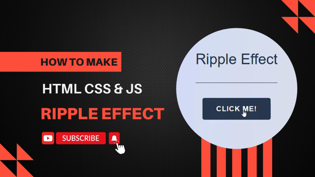
<h1>Ripple Effect</h1>
<button class="btn">
<span>Click me!</span>
<span class="ripple"></span>
</button>
</div>
<script src="ripple-effect.js"></script>CSS:
The button has position: relative and overflow: hidden to contain the ripple effect within the button’s bounds.
html,
body {
    height: 100%;
}

body {
    margin: 0;
    font-size: 1.5rem;
    color: #27374d;
    background-image: linear-gradient(to right, #c9d6ff, #e2e2e2);
    -webkit-tap-highlight-color: transparent;

    @media (max-width: 30em) {
        font-size: 1rem;
    }
}

.container {
    display: flex;
    flex-direction: column;
    align-items: center;
    justify-content: center;
    min-height: 100%;
    padding: 1.875rem;
}

h1 {
    --h1-spacing: 3.125rem;
    padding-bottom: var(--h1-spacing);
    margin-top: 0;
    margin-bottom: var(--h1-spacing);
    font-weight: 300;
    color: inherit;
    border-bottom: 1px solid currentColor;

    @media (max-width: 30em) {
        --h1-spacing: 1.875rem;
    }
}

.btn {
    --btn-color: #{#27374d};
    --btn-hover-color: #fff;
    --btn-bg: transparent;
    --btn-hover-bg: var(--btn-color);
    position: relative;
    padding: 0.9375em 1.875em;
    box-shadow: 0 0 0 0.0625em var(--btn-color) inset;
    border: 0;
    border-radius: 0.25em;
    font-weight: 700;
    text-transform: uppercase;
    letter-spacing: 0.05em;
    background-color: var(--btn-bg);
    color: var(--btn-color);
    cursor: pointer;
    transition: 0.225s ease-in-out;
    transition-property: box-shadow, background-color, color;

    @mixin btn-hover-style {
        box-shadow: none;
        background-color: var(--btn-hover-bg);
        color: var(--btn-hover-color);
    }

    &:focus-visible {
        @include btn-hover-style;
    }

    &:hover {
        @media (min-width: 48em) {
            @include btn-hover-style;
        }
    }
}

.ripple {
    position: absolute;
    top: 0;
    left: 0;
    width: 100%;
    height: 100%;
    overflow: hidden;

    &-item {
        position: absolute;
        display: block;
        border-radius: 50%;
        background-color: currentColor;
        animation: ripple-grow 0.65s ease-in-out forwards;
    }
}

@keyframes ripple-grow {
    from {
        opacity: 0.45;
        transform: translate(-50%, -50%) scale(0);
    }

    to {
        opacity: 0;
        transform: translate(-50%, -50%);
    }
}
JavaScript:
Adds a click event listener to all elements with the class ripple.
const SELECTOR_RIPPLE = ".ripple";
const TAG_NAME_RIPPLE_ITEM = "span";
const CLASS_NAME_RIPPLE_ITEM = "ripple-item";
const DELAY_MS = 100;

class Ripple {
    constructor(element) {
        this._element = element;
        this._allow = true;
    }

    init() {
        this._addEventListener();
    }

    _spawn(event) {
        if (!this._allow) {
            return;
        }

        this._allow = false;

        setTimeout(() => {
            this._allow = true;
        }, DELAY_MS);

        const item = document.createElement(TAG_NAME_RIPPLE_ITEM);
        item.classList.add(CLASS_NAME_RIPPLE_ITEM);

        this._element.append(item);
        this._setSize(item);
        this._setPosition(item, event);

        this._queueRemove(item);
    }

    _queueRemove(item) {
        item.addEventListener("animationend", () => {
            item.remove();
        });
    }

    _setPosition(item, { clientX, clientY }) {
        const rect = item.getBoundingClientRect();

        const x = clientX - rect.left;
        const y = clientY - rect.top;

        item.style.top = `${y}px`;
        item.style.left = `${x}px`;
    }

    _setSize(item) {
        const width = this._element.offsetWidth;
        const height = this._element.offsetHeight;
        const size = width > height ? width : height;
        const normalizedSize = size * Math.sqrt(2);

        item.style.width = `${normalizedSize}px`;
        item.style.height = `${normalizedSize}px`;
    }

    _addEventListener() {
        this._element.addEventListener("click", (event) => {
            this._spawn(event);
        });
    }
}

for (const el of document.querySelectorAll(SELECTOR_RIPPLE)) {
    const instance = new Ripple(el);
    instance.init();
}
Happy coding!
