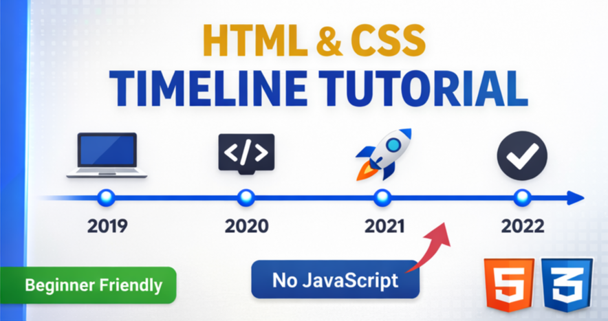
Learn how to create a clean and simple vertical timeline using only HTML and CSS.
This beginner-friendly tutorial covers structure, styling, and layout without JavaScript.
Perfect for portfolios, resumes, roadmaps, and history sections on websites.
👍 Like | 💬 Comment | 🔔 Subscribe for more web design tutorials!
HTML:
Create a HTML file and add the following code:
<section class='timeline'>
  <article>
    <div class='timeline__content'>
      <h1>What is Lorem Ipsum</h1>
      <time datetime='2024'>2024</time>
      <hr/>
      <p>Lorem Ipsum is simply dummy text of the printing and typesetting industry. Lorem Ipsum has been the industry's standard dummy text ever since the 1500s.</p>
    </div>
		<img src='https://codewithubes.in/cloud-images/lake.jpg?w=400' alt='camera on a map on a desk'/>
  </article>
  <article>
    <div class='timeline__content'>
      <h1>Where does it come from</h1>
      <time datetime='2025'>2025</time>
      <hr/>
      <p>Contrary to popular belief, Lorem Ipsum is not simply random text. It has roots in a piece of classical Latin literature from 45 BC, making it over 2000 years old.</p>
    </div>
		<img src='https://codewithubes.in/cloud-images/mountain.jpg?w=400' alt='mountain landscape'/>
  </article>
</section>
CSS:
Create a CSS file and add the following code:
html, body, section, article {
  display: grid;
}
html {
  min-height: 100%;
}
body {
  background: #121212;
  color: #ededed;
}
.timeline {
  place-self: center;
  max-width: 50em;
}
.timeline article {
  --size: .625em;
  --highlight: lime;
  --marker:
  	radial-gradient(circle closest-side,
  			var(--highlight) calc(100% - 1px), transparent)
  		0 0/ 100% var(--size);
  grid-gap: 2em;
  grid-template-columns: 1fr 1fr;
  margin-top: -1px;
  background: var(--marker), linear-gradient(var(--highlight) 0 0) 50%/2px;
  background-repeat: no-repeat;
}
.timeline article:first-child {
  --marker:
  	linear-gradient(var(--highlight) 0 0)
  		50% 0/ var(--size) calc(.5*var(--size)) ;
}
.timeline article:nth-child(odd) img {
  grid-area: 1/1;
  justify-self: end;
}
.timeline article:not(:last-child) {
  padding-bottom: 1em;
}
.timeline article > * {
  border-radius: var(--size);
}
.timeline__content {
  padding: 1em;
  background: rgba(255, 255, 255, 0.07);
}
.timeline h1 {
  margin: 0 0 var(--size);
  color: #88d55e;
  font: italic 1.375em/1 rosario, sans-serif;
  text-transform: capitalize;
}
.timeline time {
  font: 700 2.5em/1.25 roboto mono, monospace;
}
.timeline hr {
  opacity: 0.3;
}
.timeline p {
  margin: 0;
  padding-top: 0.5em;
  font: 1em proza libre, sans-serif;
  text-align: justify;
}
.timeline img {
  box-sizing: border-box;
  border: solid 2px;
  width: min(100%, 13em);
  aspect-ratio: 1.3;
  object-fit: cover;
}
Video:
HTML #CSS #WebDesign #Timeline #FrontendDevelopment #UIDesign #CSSProjects #HTMLCSS #WebDeveloper
Happy coding!