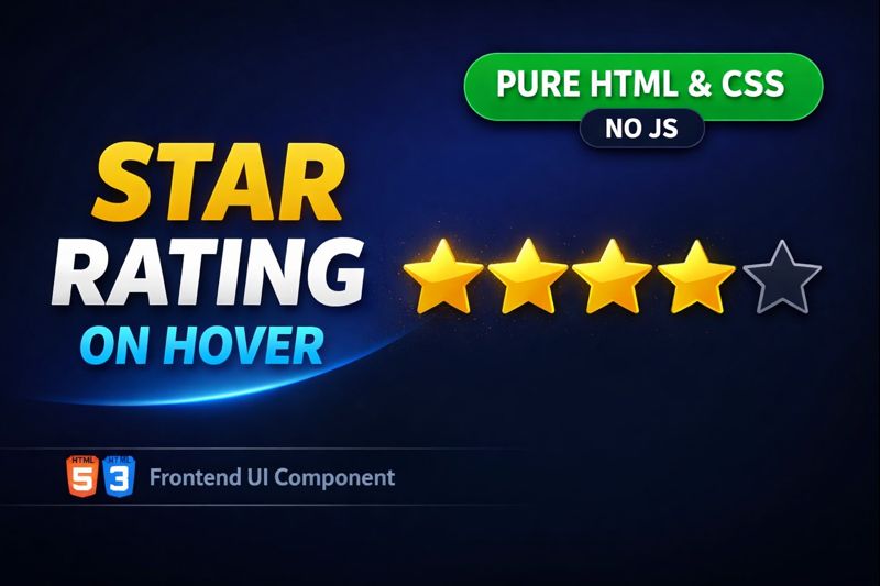
Learn how to create a star rating system on hover using pure HTML and CSS — no JavaScript required! ⭐
This tutorial is perfect for beginners and frontend developers who want to add interactive UI elements like hover rating effects to websites, portfolios, or forms.
✔️ Clean & simple HTML
✔️ Pure CSS hover effect
✔️ No JavaScript
✔️ Beginner-friendly
✔️ Useful for reviews & feedback systems
👉 Great for rating components, product reviews, and modern UI designs.
HTML:
Create a HTML file and add the following code:
<div id="wrapper">
  <h2>Rating on Hover</h2>
  <p>How do you like them apples?</p>
  <button style="--btnColor:#c72a29;">Yuck!</button>
  <button style="--btnColor:#f47f20;">Fine</button>
  <button style="--btnColor:#ffb300;">Meh</button>
  <button style="--btnColor:#a1c15a;">Good</button>
  <button style="--btnColor:#4dae50;">Awsome</button>
  <sup>* Hover the buttons above</sup>
</div>
CSS:
Create a CSS file and add the following code:
body {
  display: flex;
  justify-content: center;
  align-items: center;
  position: absolute;
  inset: 0;
  font-family: "Google Sans", sans-serif;
  font-weight: 400 !important;
  background-color: #eeeeee;
  color: #333333;
  user-select: none;
  -webkit-tap-highlight-color: transparent;
}

h2 {
  font-weight: 400 !important;
  font-size: 2rem;
  margin: 0;
}

p {
  margin: 0;
  margin-bottom: 0.5em;
}

sup {
  font-size: 0.85rem;
  color: #888888;
  margin: 0;
  margin-top: 1em;
  font-style: italic;
}

#wrapper {
  display: flex;
  flex-direction: column;
  gap: 12px;
  width: 240px;
  background-color: #ffffff;
  padding: 24px 40px;
  border-radius: 24px;
  border: 1px solid #cccccc;
}

button {
  position: relative;
  text-align: left;
  padding: 12px;
  padding-left: 32px;
  background-color: white;
  border: 1.5px solid var(--btnColor);
  border-radius: 8px;
  color: inherit;
  font-size: 1rem;
  cursor: pointer;
  transition: border 300ms ease-in-out 0s, padding 300ms ease-in-out 0s;
}

button::before,
button::after {
  content: "";
  position: absolute;
  top: 16px;
  left: 12px;
  width: 10px;
  height: 10px;
  border-radius: 50%;
  background-color: var(--btnColor);
  transition: transform 200ms cubic-bezier(0.41, -0.23, 0.55, 1.24) 0s,
    background-color 200ms cubic-bezier(0.41, -0.23, 0.55, 1.24) 0s;
}

button:hover {
  border-left-width: 12px;
  padding-left: 26px;
}

button:active {
  border-left-width: 24px;
  transition: border 150ms ease-in-out 0s, padding 150ms ease-in-out 0s;
}

button:hover::before {
  transform: translateX(-17px);
  background-color: white;
}
button:hover::after {
  transform: translateX(-17px);
  clip-path: polygon(50% 0, 100% 0, 100% 98%, 50% 100%);
}
HTML #CSS #StarRating #HoverEffect #FrontendDevelopment #WebDesign #NoJavaScript #UIDesign #CSSAnimation #CodingTutorial
Happy coding!