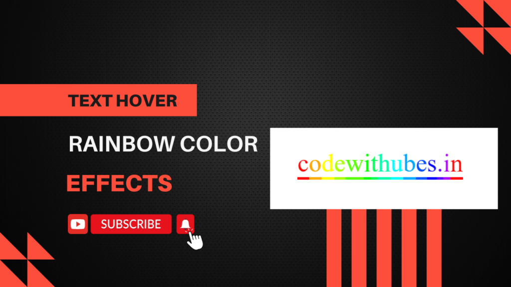
In this tutorial, you’ll learn how to create an eye-catching rainbow text effect using only CSS. This effect makes use of linear gradients to apply a rainbow color scheme to the text and adds a smooth transition for a striking hover effect. Additionally, a colorful underline is added to enhance the visual appeal. Follow along to easily implement this vibrant effect in your projects!
HTML:
Create an HTML file and add the following code:
<!DOCTYPE html>
<html lang="en">
<head>
    <meta charset="UTF-8">
    <meta name="viewport" content="width=device-width, initial-scale=1.0">
    <title>CSS sibling selector when hover</title>
    <link rel="stylesheet" href="styles.css">
</head>
<body>
    <div>
        <a href="https://codewithubes.in">
           <span>c</span><span>o</span><span>d</span><span>e</span><span>w</span><span>i</span><span>t</span><span>h</span><span>u</span><span>b</span><span>e</span><span>s</span><span>.</span><span>i</span><span>n</span>
       </a>
</div>
</body>
</html>
CSS:
Create a styles.css file and add the following code:
div {
	 width: 100vw;
	 height: 100vh;
	 display: flex;
	 justify-content: center;
	 align-items: center;
}
a {
	 font-family: 'Barabara';
	 text-decoration: none;
	 font-size: 50px;
	 color: red;
}
span {
	 position: relative;
	 transition: 0.1s all ease;
	 top: 0;
}
span:before {
	 content: '';
	 width: 100%;
	 height: 5px;
	 position: absolute;
	 background-color: red;
	 top: 100%;
	 transition: 0.1s all ease;
}
a:hover span {
	 top: -30px;
}
a:hover span:before {
	 height: 50px;
}
span:nth-child(2) {
	 color: #fa0;
}
span:nth-child(2):before {
	 background-color: #fa0;
}
span:nth-child(3) {
	 color: #ff0;
}
span:nth-child(3):before {
	 background-color: #ff0;
}
span:nth-child(4) {
	 color: #af0;
}
span:nth-child(4):before {
	 background-color: #af0;
}
span:nth-child(5) {
	 color: #5f0;
}
span:nth-child(5):before {
	 background-color: #5f0;
}
span:nth-child(6) {
	 color: #0f0;
}
span:nth-child(6):before {
	 background-color: #0f0;
}
span:nth-child(7) {
	 color: #0f5;
}
span:nth-child(7):before {
	 background-color: #0f5;
}
span:nth-child(8) {
	 color: #0fa;
}
span:nth-child(8):before {
	 background-color: #0fa;
}
span:nth-child(9) {
	 color: #0ff;
}
span:nth-child(9):before {
	 background-color: #0ff;
}
span:nth-child(10) {
	 color: #0af;
}
span:nth-child(10):before {
	 background-color: #0af;
}
span:nth-child(11) {
	 color: #05f;
}
span:nth-child(11):before {
	 background-color: #05f;
}
span:nth-child(12) {
	 color: #00f;
}
span:nth-child(12):before {
	 background-color: #00f;
}
span:nth-child(13) {
	 color: #50f;
}
span:nth-child(13):before {
	 background-color: #50f;
}
span:nth-child(14) {
	 color: #a0f;
}
span:nth-child(14):before {
	 background-color: #a0f;
}
span:nth-child(1) {
	 transition-delay: 0.05s;
}
span:nth-child(1):before {
	 transition-delay: 0.05s;
}
span:nth-child(2) {
	 transition-delay: 0.1s;
}
span:nth-child(2):before {
	 transition-delay: 0.1s;
}
span:nth-child(3) {
	 transition-delay: 0.15s;
}
span:nth-child(3):before {
	 transition-delay: 0.15s;
}
span:nth-child(4) {
	 transition-delay: 0.2s;
}
span:nth-child(4):before {
	 transition-delay: 0.2s;
}
span:nth-child(5) {
	 transition-delay: 0.25s;
}
span:nth-child(5):before {
	 transition-delay: 0.25s;
}
span:nth-child(6) {
	 transition-delay: 0.3s;
}
span:nth-child(6):before {
	 transition-delay: 0.3s;
}
span:nth-child(7) {
	 transition-delay: 0.35s;
}
span:nth-child(7):before {
	 transition-delay: 0.35s;
}
span:nth-child(8) {
	 transition-delay: 0.4s;
}
span:nth-child(8):before {
	 transition-delay: 0.4s;
}
span:nth-child(9) {
	 transition-delay: 0.45s;
}
span:nth-child(9):before {
	 transition-delay: 0.45s;
}
span:nth-child(10) {
	 transition-delay: 0.5s;
}
span:nth-child(10):before {
	 transition-delay: 0.5s;
}
span:nth-child(11) {
	 transition-delay: 0.55s;
}
span:nth-child(11):before {
	 transition-delay: 0.55s;
}
span:nth-child(12) {
	 transition-delay: 0.6s;
}
span:nth-child(12):before {
	 transition-delay: 0.6s;
}
span:nth-child(13) {
	 transition-delay: 0.65s;
}
span:nth-child(13):before {
	 transition-delay: 0.65s;
}
span:nth-child(14) {
	 transition-delay: 0.7s;
}
span:nth-child(14):before {
	 transition-delay: 0.7s;
}
By using these CSS techniques, you can create visually appealing text effects that enhance the user experience on your website.
Happy coding!